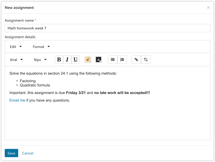
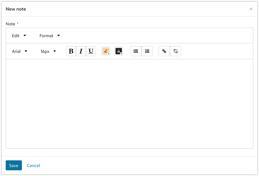
Text editor
Text editors let users format and manipulate text.
Use when
Use text editors when users need to create blocks of text that include formatted text, hyperlinks, or merge fields.
Don't use when
Don't use the text editor when users only need to enter unformatted plain text. Use a text input or textarea instead.
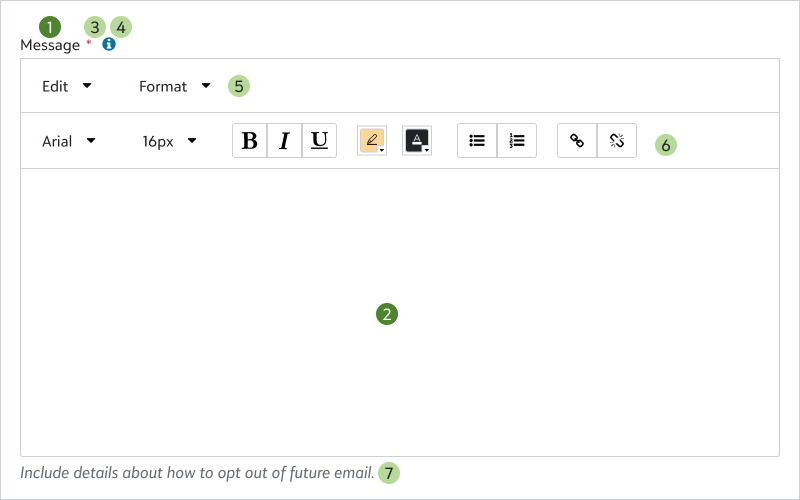
Required field marker
When a text editor is required, a red asterisk appears to the right of the label. It includes the appropriate ARIA attributes to support users of assistive technologies. For more information about required fields, see the form design guidelines.
Help inline button
When you need to supplement the text editor label with additional information but don't require persistent inline help, you can place a help inline button beside the label to invoke contextual user assistance.
Menus and toolbar
Default menus:
- Edit
- Format
Optional menu:
- Merge
Default toolbar actions:
- Font
- Text size
- Text style (bold/italic/underline)
- Text color
- Highlight color
- List format (numbered/bulleted)
- Hyperlink
Optional toolbar actions:
- Alignment (left/center/right)
- Undo/redo
- Indentation
Hint text
To highlight important considerations about a text editor, use hint text. This persistent inline help can explain details such as:
- The correct format
- Any constraints on text editor content
- Additional instructions or context, such as how data is used
Stacked margin
For consistent vertical spacing when a text editor is immediately followed by another form input, use stacked
Don't use stacked
- Is the last input before a field group
- Is the last input on a form

Components
Guidelines
- Defined in
SkyTextEditorModule- NPM package
@skyux/text-editor- Installation
- None found.
npm install --save-exact @skyux/text-editor
HTML sanitization
Don't blindly trust the HTML that users provide in the text editor. They can insert malicious content into HTML strings before you save it to your service, so we recommend using an HTML sanitizer to clean up the HTML and protect against XSS attacks.
- We recommend the HtmlSanitizer package for C# projects.
- We recommend the Owasp HTML Sanitizer package for Java projects.
Make sure that you allow the attributes and schemes that you need. For example, email links often violate the default rules of HTML sanitizers.
The text editor component lets users format and manipulate text.
Selector
sky-text-editor
| Input | Description |
|---|---|
autofocus?: boolean | Whether to put focus on the editor after it renders. Optional. Default is false |
disabled?: boolean | Whether to disable the text editor on template-driven forms. Don't use this input on reactive forms because they may overwrite the input or leave the control out of sync.
To set the disabled state on reactive forms, use the Optional. Default is false |
fontList?: SkyTextEditorFont[] | The fonts to include in the font picker. Optional. Default is [{name: 'Blackbaud Sans', value: '"Blackbaud Sans", Arial, sans-serif'}, {name: 'Arial', value: 'Arial'}, {name: 'Arial Black', value: '"Arial Black"'}, {name: 'Courier New', value: '"Courier New"'}, {name: 'Georgia', value: 'Georgia, serif'}, {name: 'Tahoma', value: 'Tahoma, Geneva, sans-serif'}, {name: 'Times New Roman', value: '"Times New Roman"'}, {name: 'Trebuchet MS', value: '"Trebuchet MS", sans-serif'}, {name: 'Verdana', value: 'Verdana, Geneva, sans-serif'}] |
fontSizeList?: number[] | The font sizes to include in the font size picker. Optional. Default is [6, 8, 9, 10, 11, 12, 13, 14, 15, 16, 18, 20, 22, 24, 26, 28, 36, 48] |
helpKey?: string | A help key that identifies the global help content to display. When specified, a help inline
button is placed beside the text editor label. Clicking the button invokes global help
as configured by the application. This property only applies when Optional. |
helpPopoverContent?: string | TemplateRef<unknown> | The content of the help popover. When specified along with Optional. |
helpPopoverTitle?: string | The title of the help popover. This property only applies when Optional. |
hintText?: string | Persistent inline help text that provides additional context to the user. Optional. |
id?: string | The unique ID attribute for the text editor. By default, the component generates a random ID. Optional. |
initialStyleState?: SkyTextEditorStyleState | The initial styles for all content, including background color, font size, and link state. Optional. |
labelText?: string | The text to display as the text editor's label. Optional. |
linkWindowOptions?: SkyTextEditorLinkWindowOptionsType[] | The target window options for adding a hyperlink. Optional. Default is [ 'new', 'existing' ] |
menus?: SkyTextEditorMenuType[] | The menus to include in the menu bar. Optional. Default is [ 'edit', 'format' ] |
mergeFields?: SkyTextEditorMergeField[] | The merge fields to include in the merge field menu. Optional. |
placeholder?: string | Placeholder text to display when the text entry area is empty. Optional. |
stacked?: boolean | Whether the text editor is stacked on another form component. When specified, the appropriate vertical spacing is automatically added to the text editor. Optional. Default is false |
toolbarActions?: SkyTextEditorToolbarActionType[] | The actions to include in the toolbar in the specified order. Optional. Default is [ 'font-family', 'font-size', 'font-style', 'color', 'list', 'link ] |
Displays default and custom form field error messages for form field components.
Set labelText on the form field component to automatically display required,
maximum length, minimum length, date, email, phone number, time, and URL errors.
To display custom errors, include sky-form-error elements in the form field component.
Selector
sky-form-error
| Input | Description |
|---|---|
errorName: string | The name of the error. |
errorText: string | The error message to display. |
interface SkyTextEditorFont {
  name: string;
  value: string;
}| Property | Description |
|---|---|
name: string | The display name of the font. |
value: string | The CSS |
interface SkyTextEditorMergeField {
  id: string;
  name: string;
  previewImageUrl?: string;
}| Property | Description |
|---|---|
id: string | The identifier for the merge field. |
name: string | Display text for the merge field. If it is more than 18 characters, the component truncates to 15 characters. |
previewImageUrl?: string | The |
interface SkyTextEditorStyleState {
  backColor: string;
  boldState: boolean;
  font: string;
  fontColor: string;
  fontSize: number;
  italicState: boolean;
  linkState: boolean;
  underlineState: boolean;
}| Property | Description |
|---|---|
backColor: string | The background color. Accepts any CSS color value. |
boldState: boolean | Whether to make text bold. |
font: string | The font family. Available values: |
fontColor: string | The font color. Accepts any CSS color value. |
fontSize: number | The font size in pixels. |
italicState: boolean | Whether to italicize text. |
linkState: boolean | Whether to format text as a link. |
underlineState: boolean | Whether to underline text. |
type SkyTextEditorLinkWindowOptionsType = 'new' | 'existing'type SkyTextEditorMenuType = 'edit' | 'format' | 'merge-field'type SkyTextEditorToolbarActionType = 'font-family' | 'font-size' | 'font-style' | 'color' | 'list' | 'alignment' | 'indentation' | 'undo-redo' | 'link'<div class="sky-padding-even-xl">
<form [formGroup]="formGroup">
<sky-text-editor
formControlName="myText"
helpPopoverTitle="Ensure deliverability"
helpPopoverContent="High quality, relevant email content and calls to action drive
engagement and avoid being marked as junk mail. For details, see writing
for engagement and deliverability."
hintText="Include details about how to opt out of future email."
labelText="Message"
>
<sky-form-error
*ngIf="myText.errors?.['companyName']"
errorName="companyName"
errorText="Message must include company name."
/>
</sky-text-editor>
</form>
</div>import { CommonModule } from '@angular/common';
import { Component, inject } from '@angular/core';
import {
AbstractControl,
FormBuilder,
FormControl,
FormGroup,
FormsModule,
ReactiveFormsModule,
ValidationErrors,
Validators,
} from '@angular/forms';
import { SkyTextEditorModule } from '@skyux/text-editor';
function validateText(
control: AbstractControl<string>,
): ValidationErrors | null {
return !control.value?.includes('Blackbaud') ? { companyName: true } : null;
}
@Component({
standalone: true,
selector: 'app-demo',
templateUrl: './demo.component.html',
imports: [
FormsModule,
ReactiveFormsModule,
SkyTextEditorModule,
CommonModule,
],
})
export class DemoComponent {
protected formGroup: FormGroup;
public myText: FormControl;
#richText = `<font style="font-size: 18px" face="Arial" color="#a25353"><b>Exclusively committed to your impact</b></font><p>Since day one, Blackbaud has been 100% focused on driving impact for social good organizations.</p><p>We equip change agents with <b>cloud software</b>, <i>services</i>, <u>expertise</u>, and <font color="#a25353">data intelligence</font> designed with unmatched insight and supported with unparalleled commitment. Every day, our <b>customers</b> achieve unmatched impact as they advance their missions.</p>`;
constructor() {
this.myText = new FormControl(this.#richText, {
nonNullable: true,
validators: [Validators.required, validateText],
});
this.formGroup = inject(FormBuilder).group({
myText: this.myText,
});
}
}