Flyout
Use when
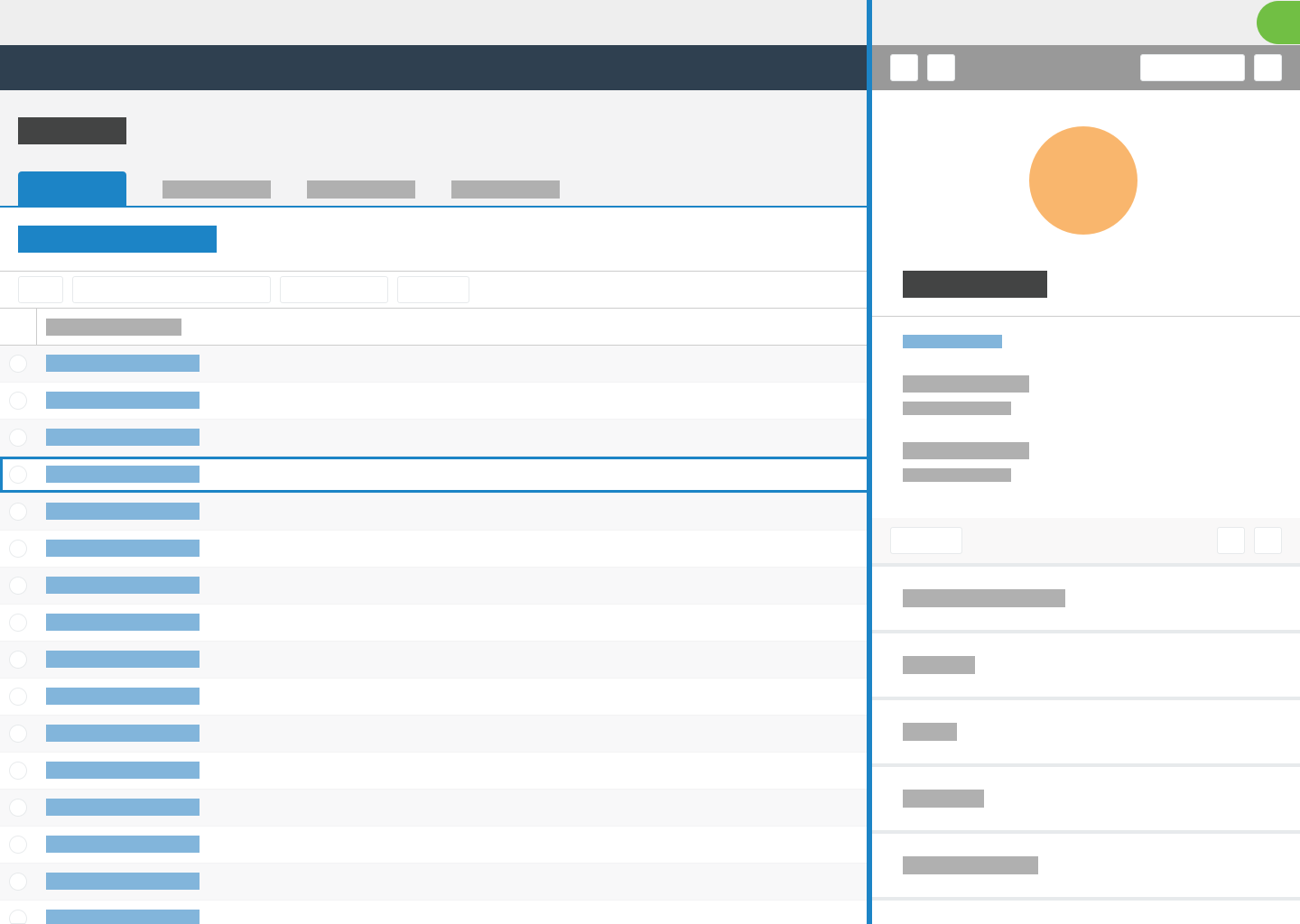
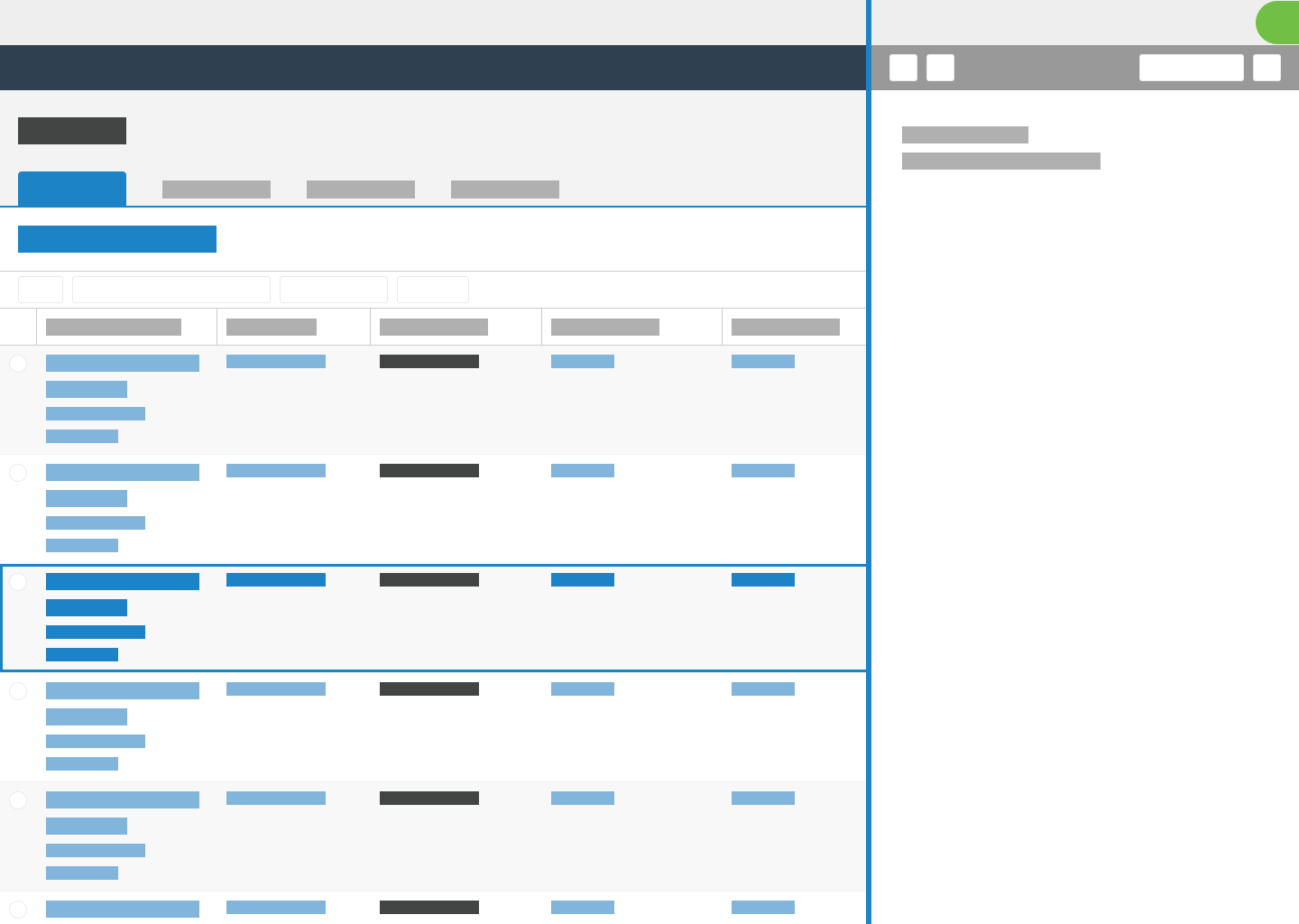
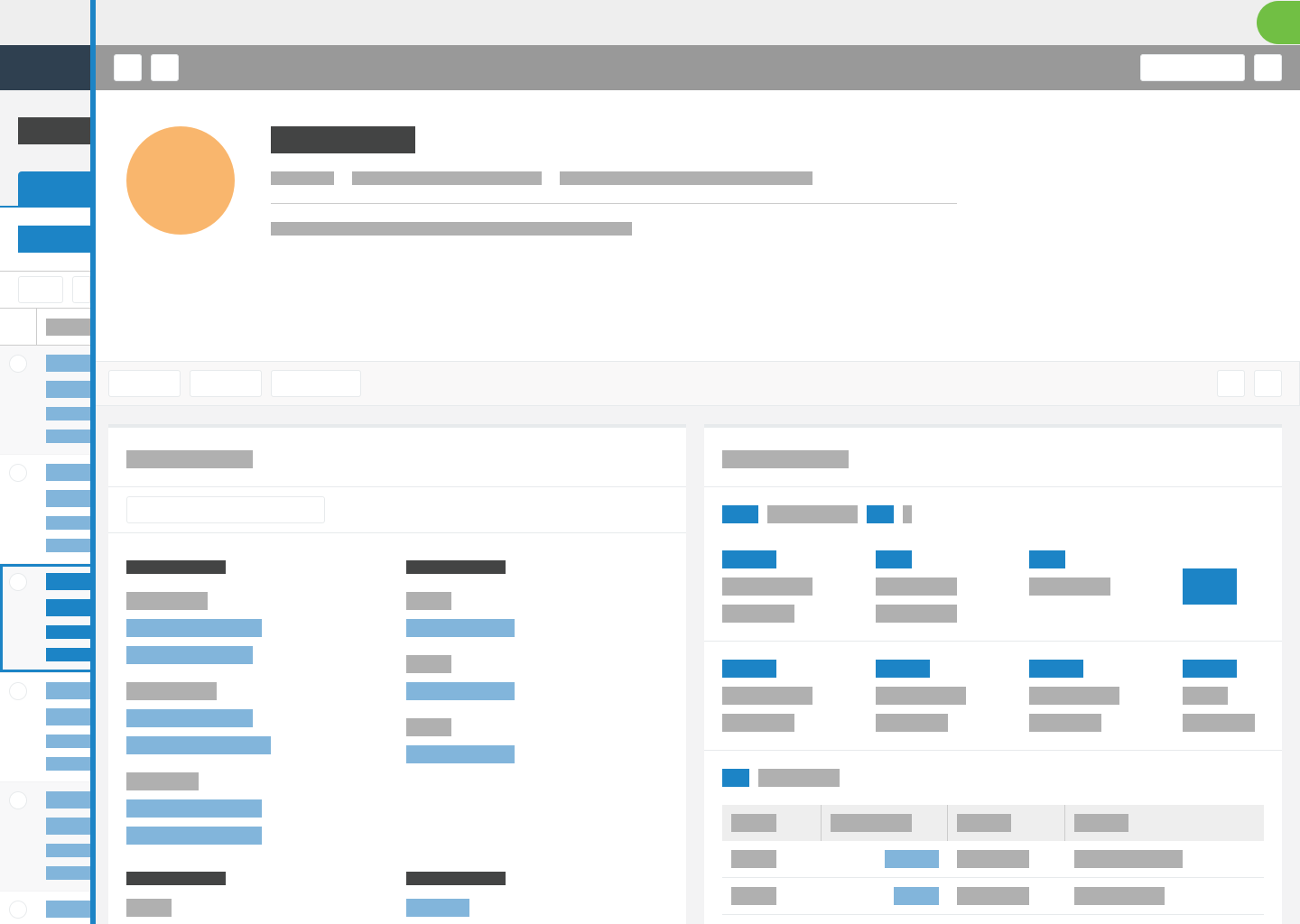
Use flyouts to display large amounts of supplementary information related to user tasks. The flyout container slides out from the side of the page and lays over page content. It can contain lists, record views, graphs, or other information displays.

Use flyouts to drill into analytical insights so that users can quickly glance into what makes up those insights without spawning new workflows.
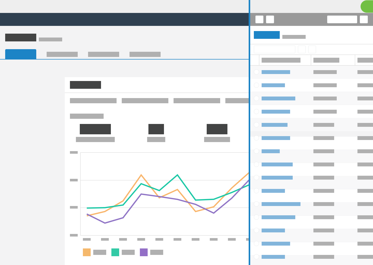
Use flyouts to drill into child records so that users can retain the context of the parent records. Flyouts only cover part of the page, so users can refer to the page for context.

Don't use when
Don't use flyouts to navigate from one record to another instance of the same record type. For example, if users on a constituent record select a link to a different constituent record, navigate to the new record. Do not open it in a flyout.
Don't use flyouts to navigate from a child page to its parent page. For example, if users on a gift record select a link to return to a constituent record, navigate to a full-page view of the constituent record. Do not open it in a flyout.
Don't use flyouts when another flyout is already open. If users select a link in a flyout, close the flyout and navigate to the new link location. In other words, limit flyouts to a single drill-in. On further drilling, open a full page.
Don't use flyouts on pages that don't make sense when it closes. For example, on a page to enter grades for a class of students, displaying the names of students doesn't provide value without the grade entry form, so don't use a flyout to display the grade entry form.
Don't use flyouts to display small amounts of additional information. Flyouts are for large amounts of supplementary information. To display smaller amounts of information, use a popover component or an expandable repeater.
Don't use flyouts to display items that need a long time to load such as system-generated reports. Instead, let users continue to use the system, and use toasts to let them know when the content is available.

Don't use flyouts to link to external sites. Open external sites in new tabs. For example, when users select a constituent address, a Google map of that address opens in a new tab.
Don't use flyouts for tasks where users require a full-screen view of details or where they take multiple actions within the view. Navigate to a full page instead.
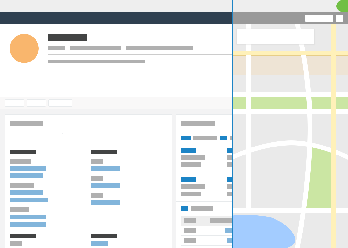
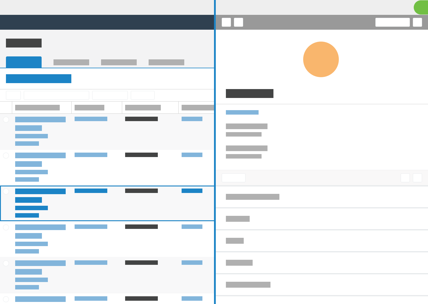
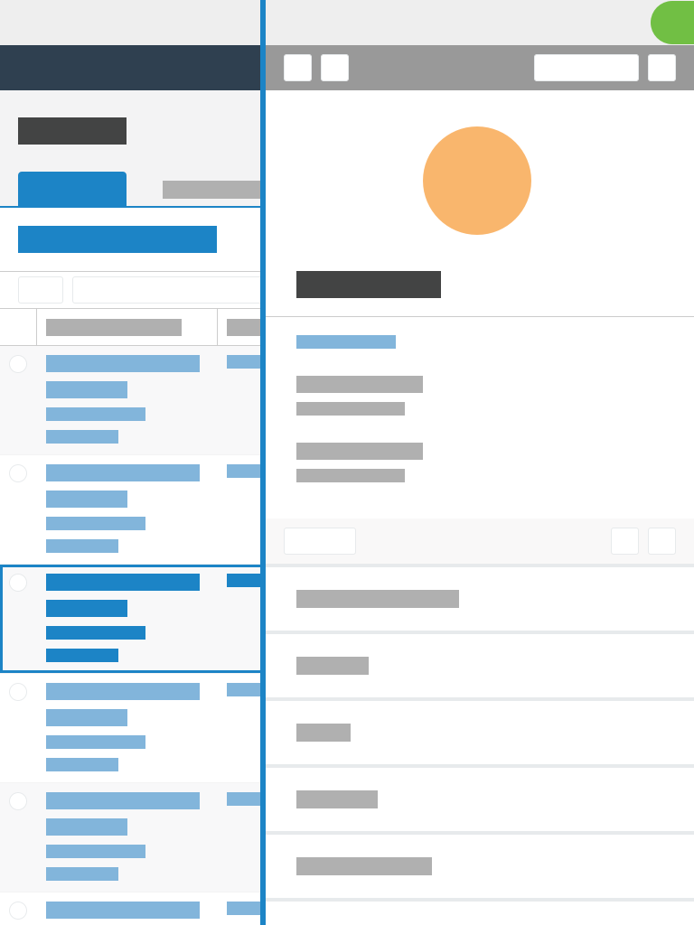
Background page remains active
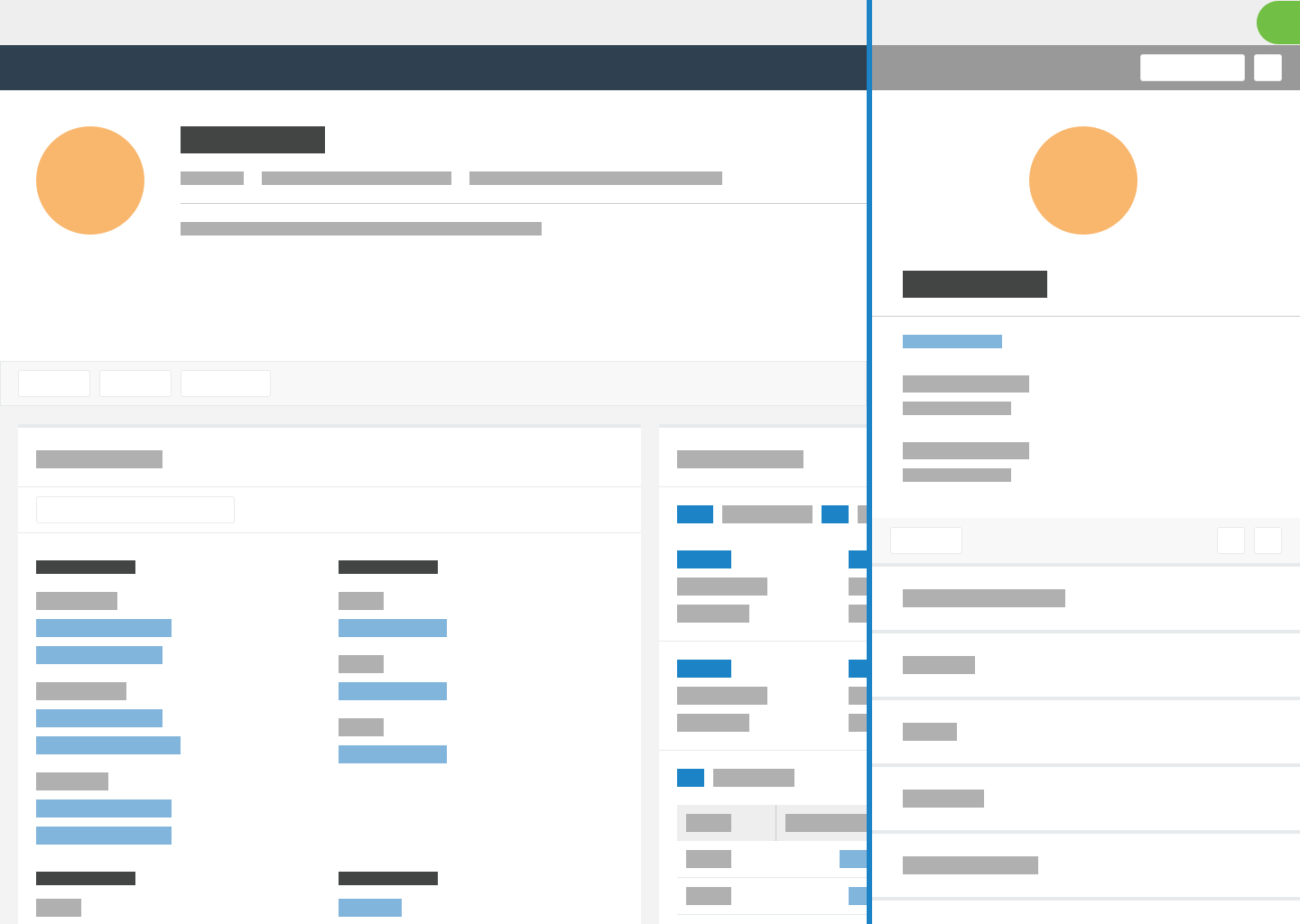
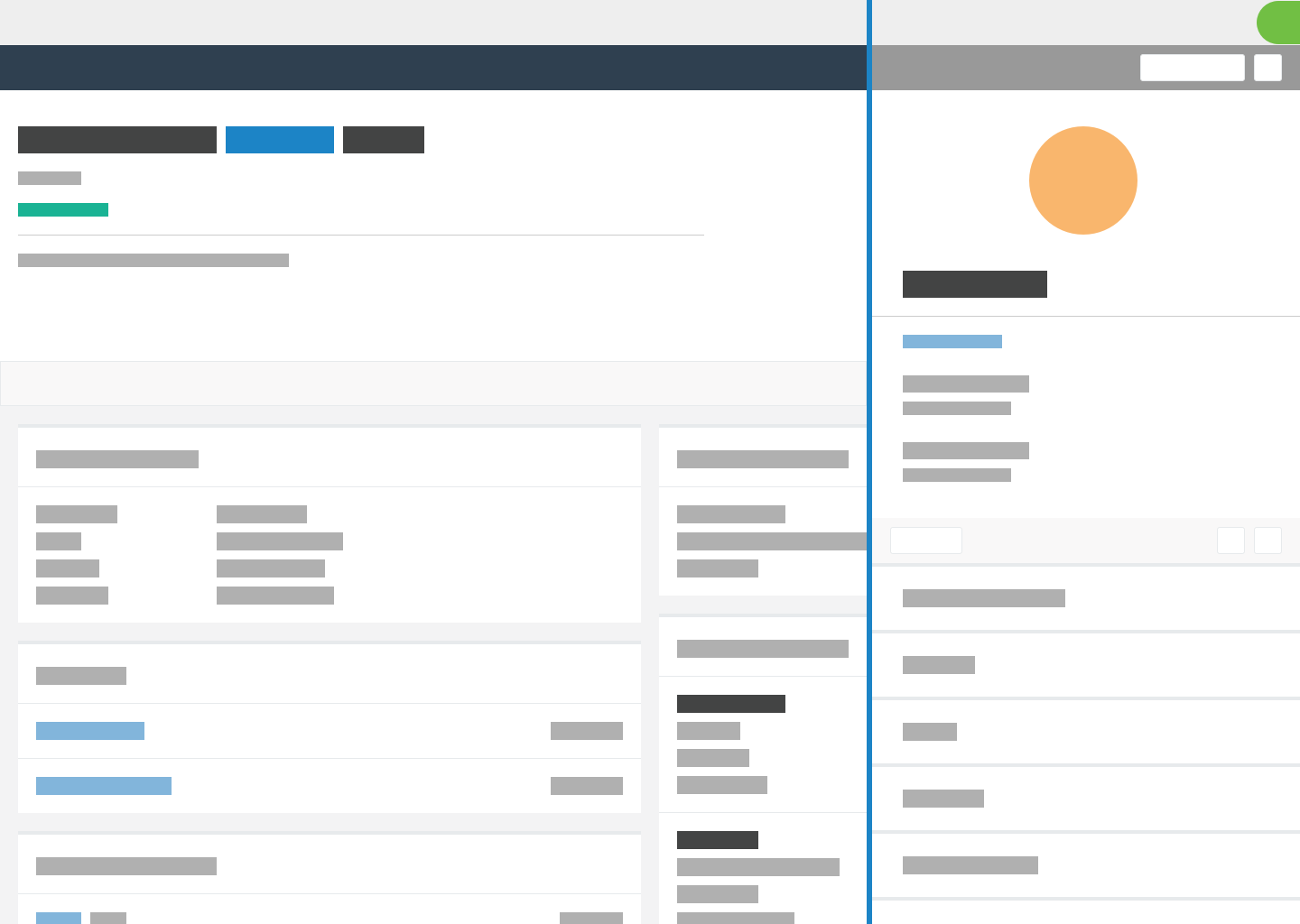
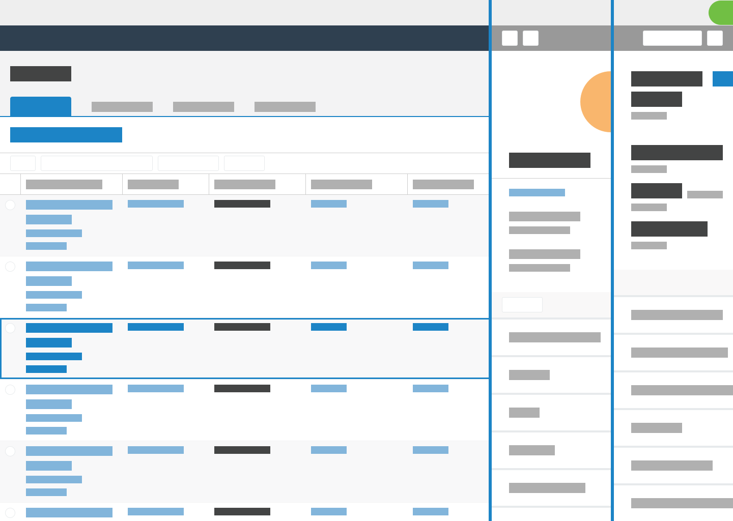
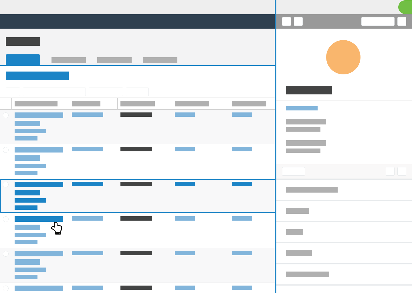
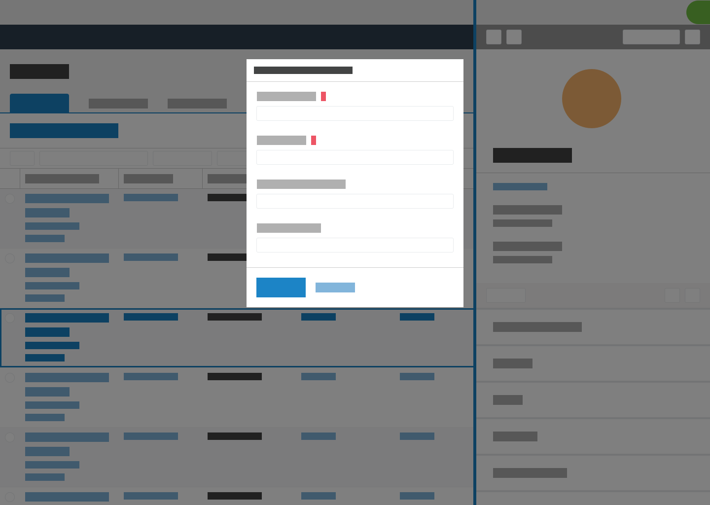
The background page remains active behind a flyout. When users select a link on the background page to open another record in a list, the flyout loads the new record. When users select a link inside the flyout, the system navigates away from the current page.
When users select a non-interactive element on the background page, the flyout closes. However, when users select a non-interactive element on the background page on touch devices, the flyout does not close because users need to be able touch the background page in order to scroll.
 |  |  |
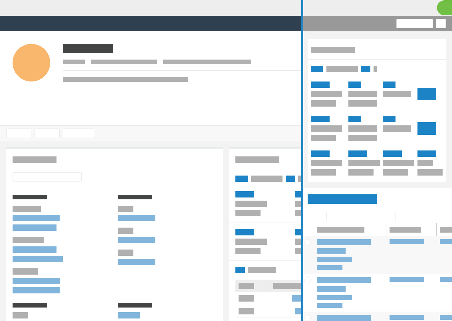
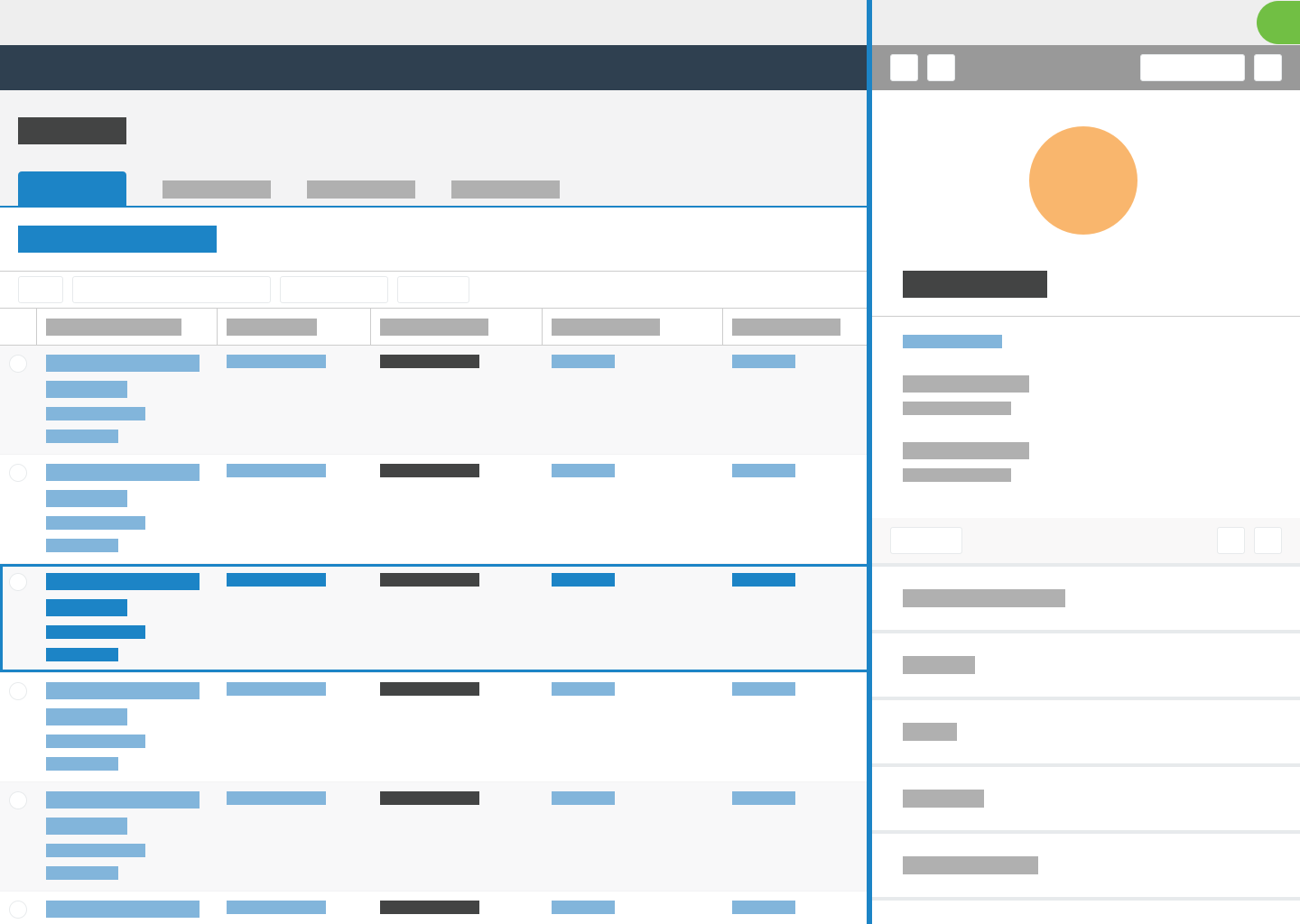
Independent scrolling
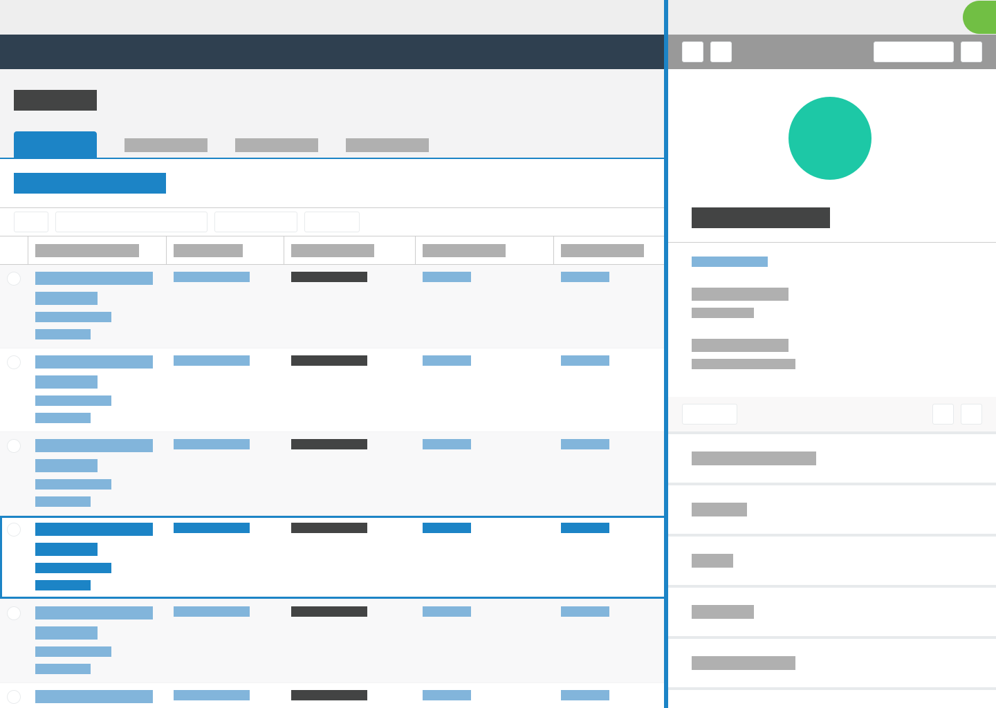
The flyout and its background page scroll independently. When users touch, hover, or focus on the background page, only the background content scrolls. Similarly, when users touch, hover, or focus on the flyout, only the flyout scrolls. This allows users to adjust the content in the flyout without losing context from the page.
 |  |  |
Drag to resize
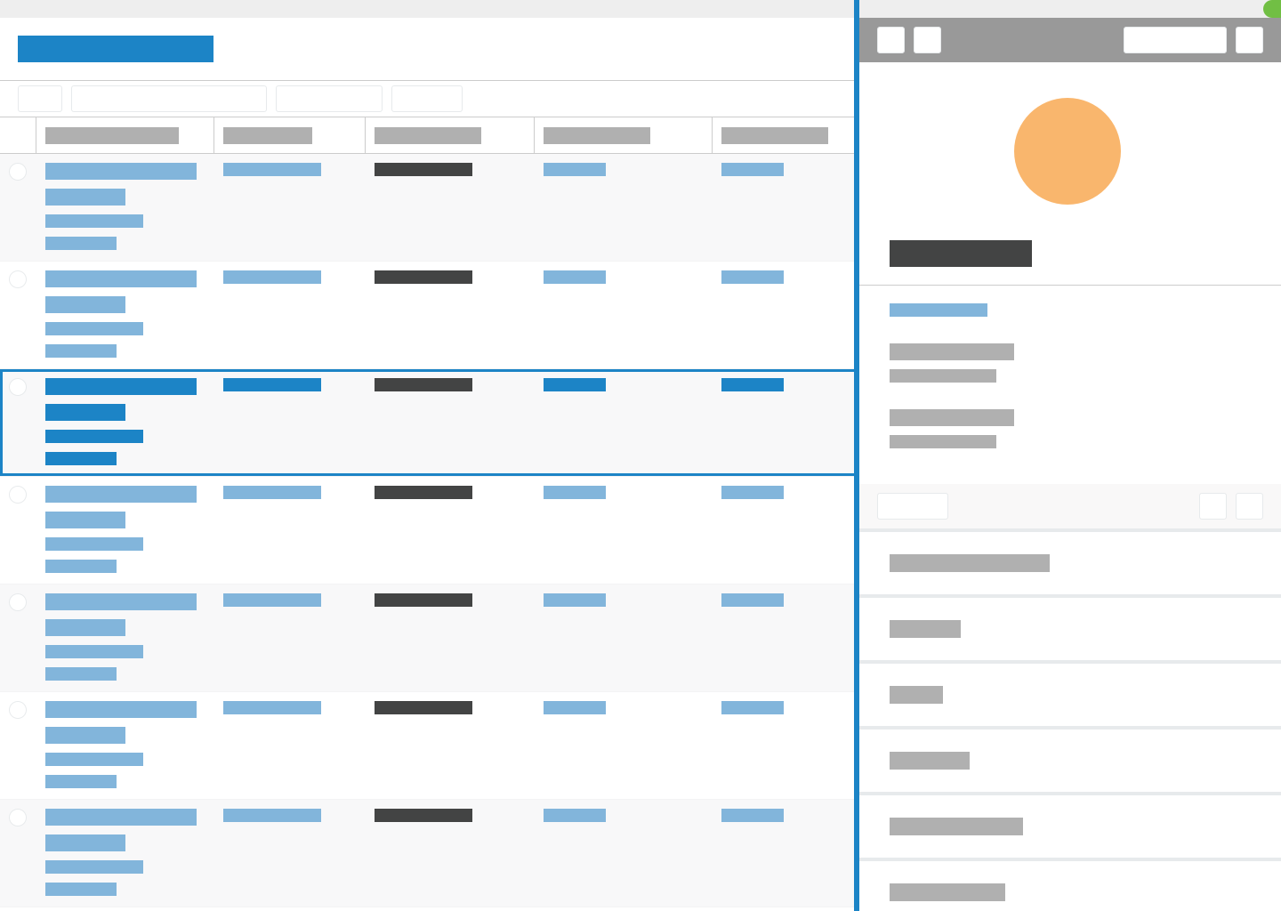
Users can select the flyout's left border and drag it to adjust the size. The size can range from 320px to 20px less than the full screen size. If users expand the flyout to the full screen size, it slides 20px to the right to keep a portion of the background page in view. The default size is 50 percent of the screen or 320px, whichever is larger. When users resize the panel, the system remembers their preferred size globally.
 |  |  |
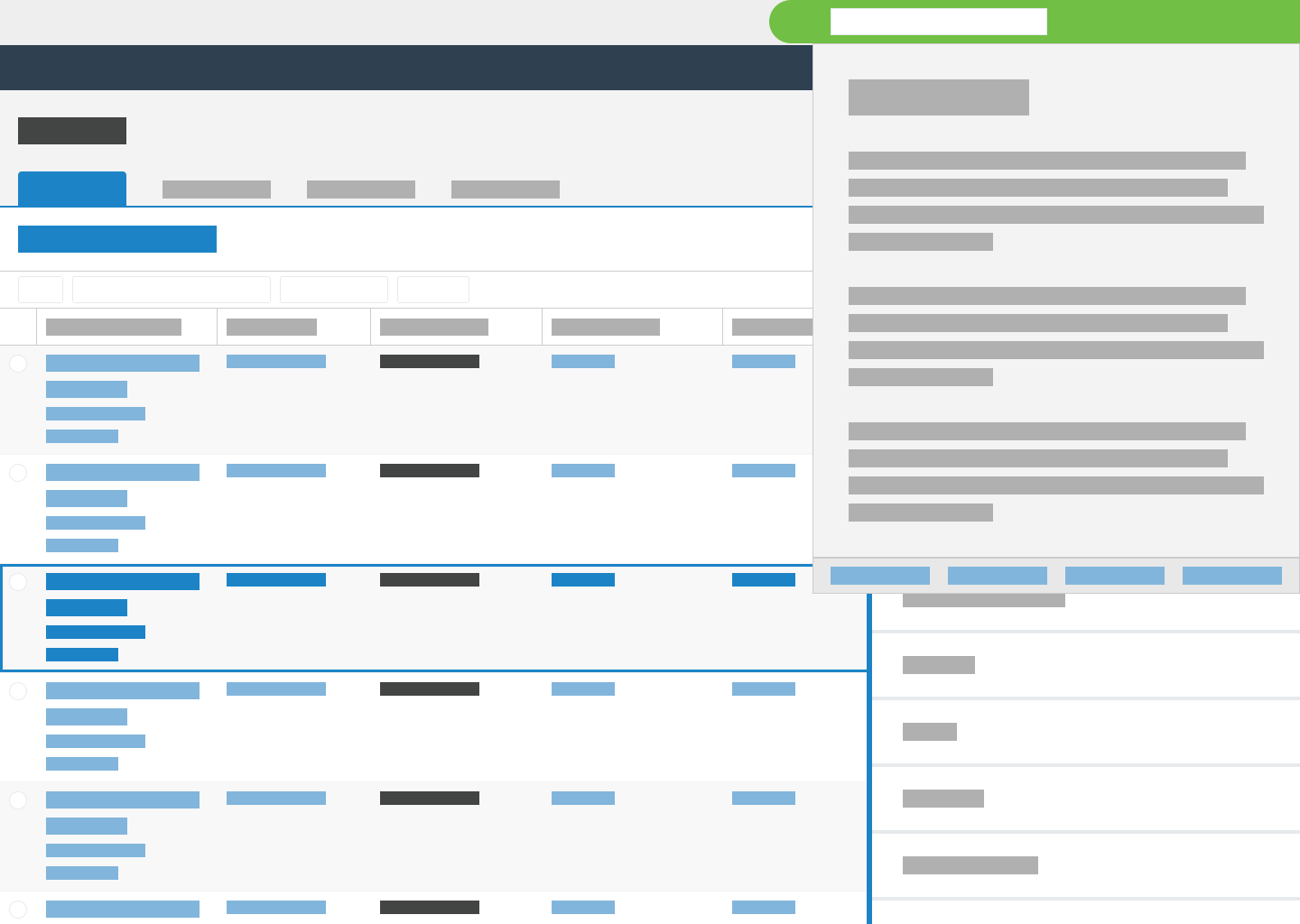
Help panel
The flyout covers the omnibar, but the help panel remains visible in the upper right corner of the screen. The help panel should recognize that the flyout is open and provide appropriate guidance based on the context.
 |  |
Modal dialog behavior
When users perform actions in the flyout to launch modal dialogs, the modal dialogs should cover the entire page.
Responsiveness
Do not use a flyout when a screen is smaller than 480px. At smaller resolutions, the flyout covers too much of the screen and loses much of its value. For smaller screen sizes, navigate directly to the appropriate record or list.
Next and previous buttons
When a flyout opens records in a list, you can include buttons in the toolbar to open the next record or previous record. For example, if users open a flyout on a constituent record to view the first gift in a list of gifts, the next button opens the second gift in the list. When you include the next and previous buttons in the flyout toolbar, a visual indicator highlights the currently selected row on the page.

List toolbar
When a flyout displays a list, you can include an option in the toolbar to leave the "preview" list and create a new list for further manipulation. The create list button navigates to a new page that contains the new list.

Follow these guidelines to ensure that people can use flyouts with assistive technology or keyboards.
When a flyout opens, place focus on the first focusable item. If the flyout does not include focusable items, then place focus on the flyout container element.
While a flyout is open, limit focus to elements in the flyout. Do not move focus back to the initiating page behind the flyout. On the last focusable item, the Tab key should return focus to the first focusable item. And on the first focusable item, the Shift+Tab keys should switch focus to the last focusable item.
When a flyout closes, return focus to the element that had focus before the flyout opened. This is usually the element that opened the flyout.
Guidelines
- NPM package
@skyux/flyoutView in NPM | View in GitHub None found.- Install with NPM
npm install --save-exact @skyux/flyoutNone found.
Launches flyouts and provides a common look and feel.
This service dynamically generates the flyout component and appends it directly to the
document's body element. The SkyFlyoutInstance class watches for and triggers flyout events.
Methods
close(args?: SkyFlyoutCloseArgs): void
Closes the flyout. This method also removes the flyout's HTML elements from the DOM.
Parameters
args?: SkyFlyoutCloseArgs
Arguments used when closing the flyout.
Returns
void
open(component: Type$1<T>, config?: SkyFlyoutConfig): SkyFlyoutInstance<T>
Opens a flyout and displays the specified component.
Parameters
component: Type$1<T>
Specifies the component to render.
config?: SkyFlyoutConfig
Specifies the flyout configuration passed to the specified component's constructor.
Returns
Specifies the configuration options to set up a flyout.
interface SkyFlyoutConfig {
  ariaDescribedBy?: string;
  ariaLabel?: string;
  ariaLabelledBy?: string;
  ariaRole?: string;
  defaultWidth?: number;
  iteratorNextButtonDisabled?: boolean;
  iteratorPreviousButtonDisabled?: boolean;
  maxWidth?: number;
  minWidth?: number;
  permalink?: SkyFlyoutPermalink;
  primaryAction?: SkyFlyoutAction;
  providers?: any[];
  settingsKey?: string;
  showIterator?: boolean;
}
Properties
ariaDescribedBy?: string
The HTML element ID of the element that describes
the flyout. This sets the flyout's aria-describedby attribute
to provide a text equivalent for screen readers to support accessibility.
The description typically includes text on the flyout but not on items that users
interact with, such as buttons and forms.
For more information about the aria-describedby attribute, see the WAI-ARIA definition.
ariaLabel?: string
The ARIA label for the flyout. This sets the flyouts's aria-label attribute to provide a text equivalent for screen readers
to support accessibility.
If the flyout includes a visible label, use ariaLabelledBy instead.
For more information about the aria-label attribute, see the WAI-ARIA definition.
ariaLabelledBy?: string
The HTML element ID of the element that labels
the flyout. This sets the flyout's aria-labelledby attribute to provide a text equivalent for screen readers
to support accessibility.
If the flyout does not include a visible label, use ariaLabel instead.
For more information about the aria-labelledby attribute, see the WAI-ARIA definition.
ariaRole?: string
The ARIA role for the flyout to support accessibility by indicating how the flyout functions and what it controls. For information about how an ARIA role indicates what an item represents on a web page, see the WAI-ARIA roles model.
defaultWidth?: number
The default width of the flyout container. If you do not provide a width, the flyout defaults to half the width of its container.
iteratorNextButtonDisabled?: boolean
Disables the next iterator button in the flyout header that accesses the next record in a record set.
iteratorPreviousButtonDisabled?: boolean
Disables the previous iterator button in the flyout header that accesses the previous record in a record set.
maxWidth?: number
The maximum resize width of the flyout container.
minWidth?: number
The minimum resize width of the flyout container.
permalink?: SkyFlyoutPermalink
Displays a permalink button in the flyout header that navigates users to the URL (or application route) representative of the flyout's contents.
primaryAction?: SkyFlyoutAction
Displays a configurable button in the flyout header.
providers?: any[]
The array of custom providers to pass to the component's constructor.
settingsKey?: string
The unique key for the UI Config Service to retrieve stored settings from a database. The UI Config Service saves configuration settings for users to preserve the width of the flyout. For more information about the UI Config Service, see the sticky settings documentation.
showIterator?: boolean
Whether to display iterator buttons in the flyout header to access the next and previous records in a record set.
Represents a single displayed flyout.
Properties
closed: EventEmitter<void>
An event that the flyout instance emits when it closes.
componentInstance: T
The instance of the component to display in the flyout.
isOpen: boolean
A boolean value that returns true if the flyout is open.
Default: true
beforeClose: Observable<SkyFlyoutBeforeCloseHandler>
An event that the modal instance emits when it is about to close.
If a subscription exists for this event,
the modal does not close until the subscriber calls the handler's closeModal method.
iteratorNextButtonClick: EventEmitter<void>
An event that the flyout instance emits when users click the next iterator button.
iteratorNextButtonDisabled: boolean
Disables the next iterator button.
Default: false
iteratorPreviousButtonClick: EventEmitter<void>
An event that the flyout instance emits when users click the previous iterator button.
iteratorPreviousButtonDisabled: boolean
Disables the previous iterator button.
Default: false
Methods
close(args?: SkyFlyoutCloseArgs): void
Closes the flyout instance and emits its closed event.
Parameters
args?: SkyFlyoutCloseArgs
Arguments used when closing the flyout.
Returns
void
interface SkyFlyoutAction {
  callback?: () => void;
  closeAfterInvoking?: boolean;
  label?: string;
}
Properties
callback?: () => void
The callback function to execute when the button is clicked.
closeAfterInvoking?: boolean
Whether to close the flyout after the button is clicked.
label?: string
The button's label.
Handler for notifying the flyout when it is appropriate to close the flyout. This will be returned from the flyout instance's beforeClose observable.
Properties
closeFlyout: () => void
Function which should be called to close the flyout. This should be called once any intervening actions have completed.
Arguments used when closing a flyout programmatically.
interface SkyFlyoutCloseArgs {
  ignoreBeforeClose?: boolean;
}
Properties
ignoreBeforeClose?: boolean
Whether the SkyFlyoutBeforeCloseHandler is ignored when closing a flyout.
interface SkyFlyoutPermalink {
  label?: string;
  route?: { commands: any[]; extras?: NavigationExtras };
  url?: string;
}
Properties
label?: string
The text label for the permalink button.
route?: { commands: any[]; extras?: NavigationExtras }
The object that represents the
Angular application route.
The object includes two properties that are mapped to Angular's
Router.navigate(commands, extras?) method.
url?: string
The external URL for the permalink.
SKY UX test harnesses are built upon Angular CDK component harnesses. For more information see the Angular CDK component harness documentation.
import { SkyFlyoutHarness } from '@skyux/flyout/testing';
Harness for interacting with a flyout component in tests.
Methods
clickNextIteratorButton(): Promise<void>
Clicks the flyout's next iterator button.
Returns
Promise<void>
clickPreviousIteratorButton(): Promise<void>
Clicks the flyout's previous iterator button.
Returns
Promise<void>
clickPrimaryActionButton(): Promise<void>
Clicks the flyout's primary action button.
Returns
Promise<void>
closeFlyout(): Promise<void>
Clicks the flyout's close button.
Returns
Promise<void>
getAriaDescribedBy(): Promise<null | string>
Gets the flyout's aria-describedby attribute.
Returns
Promise<null | string>
getAriaLabel(): Promise<null | string>
Gets the flyout's aria-label attribute.
Returns
Promise<null | string>
getAriaLabelledBy(): Promise<null | string>
Gets the flyout's aria-labelledby attribute.
Returns
Promise<null | string>
getAriaRole(): Promise<null | string>
Gets the flyout's ARIA role.
Returns
Promise<null | string>
getFlyoutMaxWidth(): Promise<number>
Gets the flyout's maximum width.
Returns
Promise<number>
getFlyoutMinWidth(): Promise<number>
Gets the flyout's minimum width.
Returns
Promise<number>
getFlyoutWidth(): Promise<number>
Gets the flyout's current width.
Returns
Promise<number>
getPermalinkButtonLabel(): Promise<string>
Gets the label for the flyout's permalink button.
Returns
Promise<string>
getPermalinkButtonRoute(): Promise<null | string>
Gets the route for the flyout's permalink button.
Returns
Promise<null | string>
getPrimaryActionButtonLabel(): Promise<string>
Gets the label for the flyout's primary action button.
Returns
Promise<string>
queryHarness(query: HarnessQuery<T>): Promise<T>
Returns a child harness or throws an error if not found.
Parameters
query: HarnessQuery<T>
Returns
Promise<T>
queryHarnesses(harness: HarnessQuery<T>): Promise<T[]>
Returns child harnesses.
Parameters
harness: HarnessQuery<T>
Returns
Promise<T[]>
queryHarnessOrNull(query: HarnessQuery<T>): Promise<null | T>
Returns a child harness or null if not found.
Parameters
query: HarnessQuery<T>
Returns
Promise<null | T>
querySelector(selector: string): Promise<TestElement>
Returns a child test element or throws an error if not found.
Parameters
selector: string
Returns
Promise<TestElement>
querySelectorAll(selector: string): Promise<TestElement[]>
Returns child test elements.
Parameters
selector: string
Returns
Promise<TestElement[]>
querySelectorOrNull(selector: string): Promise<null | TestElement>
Returns a child test element or null if not found.
Parameters
selector: string
Returns
Promise<null | TestElement>
Loading...